Reflections On Notion And Building A Marketing Site
21 min 8 sec read
I joined Notion in early 2021 and left in July 2025. For a little over four years, I was the engineer responsible for the logged-out marketing site — everything a visitor sees on notion.com. The role is sometimes called “marketing engineer”: a frontend engineer with full-stack sprinkles, owning the entire marketing site stack — from the CMS powering pages to a landing page builder, localization pipeline, middleware-level A/B testing, experimentation, and analytics.
This is a technical account of how I scaled notion.com: from a handful of statically generated pages and thousands of monthly visitors to a platform serving millions of visits and over 100,000 unique routes across almost a dozen languages, with a clear path to far more. There’s a lot of ground to cover — architecture, build pipeline, content systems, performance work, operational habits — so I’m splitting it up. This part covers the engineering philosophy that shaped how I worked, how I localized the site for a global audience, and how I built a page builder that powered Notion’s biggest launches.
More than the what, I want to cover the why. Every startup has its hypergrowth moment and its own set of business constraints, so nothing here is copy-paste. Think of this as a primer on building and scaling a marketing site — with deep dives into the universal problems that come with the territory.
Philosophy of Building a Marketing Site
Notion’s marketing site may look simple from the outside. I often pitched it as a living ecosystem for user education, brand campaigns, a template marketplace, and a long tail of landing pages all running on the same foundation. Through the maelstrom of hypergrowth, the engineering culture formed around a few values that I think apply to any marketing engineering team — but were shaped by the specifics of working at Notion.
Be a Steward of the Brand (And You Really, Really, Really Need To Care About Design)
The site had a lot of contributors, and with that came responsibility. Launches that didn’t meet my standards, features that were misrepresented, obvious legal blunders, off-brand design — all of it fell under my watch. Good taste was part of the job. I used it freely whenever I could unblock someone and help them express the Notion brand the right way.
This wasn’t gatekeeping for the sake of it. When you’re growing as fast as Notion was, the marketing site is often the first thing a potential customer sees. Every page is a brand promise. I treated it that way.
Design sense was a make-or-break trait — even in interviews. Not just caring about aesthetics, but being able to work with brand designers and content engineers to steward Notion’s brand and call out when things could be better.
I agonized over type, animation timing, how text looked across languages. I was always pushing myself to outdo the last project — refining the design system, prototyping new animation techniques with brand designers, being meticulous when testing across viewports and edge cases, and combing through the site to find anything that didn’t meet my bar. I wasn’t precious about what I made — I’d work with anyone who shared that standard and push the teams around me to raise theirs.
Customer Service as an Engineering Discipline
As an engineer, my job was to unblock — designers, content editors, growth marketers, and plenty of others who needed to ship fast. That meant demystifying what looked to them like an inaccessible black box of code so they could actually own their surface area.
And when incidents hit — which they did, with immediate revenue impact — staying calm, cool, and collected wasn’t a soft skill. It was a hard requirement. The marketing site is a revenue surface. When it breaks, the meter is running.
Brand campaigns were the clearest example. They might not register as high-stakes from a product engineering perspective — where the equivalent would be the app going down — but when you’re concentrating real ad spend and visitor traffic on a contained, one-time event, things just have to work. Being able to explain the revenue impact and how to mitigate during a crisis was something I leaned into. It doesn’t do anyone favors to be stressed or panicked, even though that’s the first instinct. It takes practice to get there, and it’s a topic I care deeply about — maybe something for a future post.
Building the Ship While Sailing It
With a small team, I couldn’t afford the luxury of isolated, heads-down projects — so I didn’t bother with them. Every project pulled double duty: ship the thing, and make the next thing easier in the process.
Moving the Help Center into a CMS to support multiple languages? That became a holistic rethink of localization across the entire site. Brand campaigns became opportunities to codify design decisions that had been floating around loosely for too long. The common thread was always there — I just had to look for it.
Pain Points Are the Roadmap
I didn’t go looking for conflict — but when something is consistently painful, that pain is usually pointing at something worth building. Almost every major system I built started as a pain point someone flagged — or, more often, one someone was quietly tolerating. The trick was noticing the tension, then having the latitude to swing at a real solution instead of a patch. This ended up being the single biggest driver of my technical roadmap.
Dynamic Screenshots came from the misery of generating UI screenshots across dozens of languages by hand. The Contentful-powered page builder came from brand campaigns drowning engineers in copy-change pull requests. Middleware-based experimentation came from client-side Statsig quietly killing performance on a site where speed was everything.
And the move to Vercel came from plain old build pipeline frustration — builds on Notion’s homegrown AWS pipeline for the marketing site took upwards of two hours with frequent timeouts, and that dropped to five to ten minutes overnight. If a build timed out while pushing a hotfix for a brand campaign, you were counting hours before anything could go out. Launch days meant waiting through multiple deploys just to land a few essential PRs — copy changes, asset swaps, gate and flag updates.
Collaboration and Creative Latitude
High-stakes time crunches had a way of making teams forget to enjoy themselves. I tried not to let that happen. Tools for rapid prototyping were always worth the investment, and some of the best ideas came from someone taking a creative swing halfway through a time-sensitive launch — the kind of bet that probably shouldn’t have worked but did.
Notion had a way of demanding range — a high degree of agency, a lot of context switching, and the occasional feeling that you’re running your own lean startup inside a startup. The crew were a humble, eternally optimistic, and DIY bunch of folks. That energy mattered more than any process I could have put in place.
Localization, Regionalization, and Translations: How To Make a Site Truly Global
Localization is one of the biggest unlocks for a marketing site — and at Notion, it was directly tied to revenue. Translate your content, regionalize it by market, and you’ve suddenly got access to an audience that was always there — just never spoken to.
At Notion, traffic was split roughly between Asia, Europe, and the United States — English-speaking users were not the majority. Yet the app and marketing site were only available in English and eventually Korean. The app was already on a path to localization, but the marketing site — with its bespoke layouts, embedded screenshots, and campaign-driven timelines — was a harder problem, and by 2021 it had become the main blocker to launching revenue-generating languages. To meaningfully expand the growth funnel, I needed a scalable translation pipeline — not a file-by-file slog, but something that could keep pace with a site that was always shipping.
A localization strategy is different for every company. For me, once I had a second addressable market beyond Korea, it made more sense to think globally from the start. That mindset shift matters as much as the tooling: English is just another language. The U.S. is just another country. No market is the default.
Localization isn’t just swapping strings in a CMS or a TMS — it’s building empathy with users in that part of the world. If I’m in France, I might expect customer logos to represent companies in my country. If I’m reading in Japanese, I expect characters to render properly, and typeface selection becomes crucial. It’s easy as an English-speaking engineer in Silicon Valley to assume that what looks good to you looks good to everyone. One practice I used to fight that instinct: change the language, scroll through the site, and see if things still made sense. Notion had a team dedicated to localization QA, but if I could catch a layout issue or flag a mismatched asset at the engineering phase, I did.
Some of what you learn is genuinely surprising. Japanese users on notion.com saw a 10–20% lift in Plus conversion rates just from having content in their language. French users, on the other hand, preferred English content if the French translation wasn’t near-perfect — accuracy mattered more than the gesture of localizing at all. Every market has its own quirks, and you pick them up fast.
Translation Management Systems
What I landed on was a layered system. A headless CMS (Contentful) connected to a translation management system handled the bulk of content, routing strings to translators in real time with batched processes running in parallel. Hard-coded strings in the codebase — nav elements, UI copy, contact buttons — were handled via a React i18n library. Long-form content like blog posts and help articles went through the TMS too, but were routed to in-house translators who could preserve Notion’s voice and keep product descriptions accurate.
Notion started with Lokalise for translating code-based strings, then worked with the localization team to migrate to Smartling and eventually Phrase to hook it into Contentful. By the end Notion was running two translation management systems side by side:
- Lokalise handled application-level strings and lightweight UI copy on the marketing site — the login button, the “Contact Us” button, global nav elements.
- Phrase handled everything else. Content that went into Contentful was automatically routed to Phrase for translation and came back localized.
That migration happened around the third language launch - French.
One gap in this pipeline was assets. Translation management systems are great at handling text, but they don’t handle images — and the marketing site was full of UI screenshots with text baked into them. Contentful gave me asset management, but there was no way to swap the text inside a screenshot the way you’d swap a translated string. Every new language meant re-creating those screenshots from scratch, and the cost compounded fast: more assets per launch, more languages globally, and the tight turnaround times that brand campaigns demanded.
Brand campaigns made this especially acute — short timelines, high stakes, real advertising dollars driving traffic. I needed a way to represent Notion’s UI that could scale across languages with only the content changing. The UI itself rarely looked radically different from one campaign to the next; I just needed the text to update. That constraint pointed toward something unconventional.
Dynamic Screenshots — Dumb Product UI Rendered Smartly
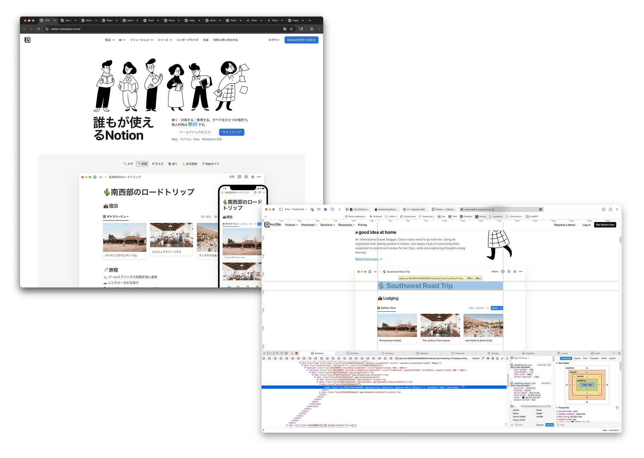
This one started the way the best projects do — someone flagged a problem, and I couldn’t stop thinking about it until I’d rage-coded my way to a solution.
The issue was localized UI screenshots. Creating them required hardware the team didn’t have, and scaling them across dozens of languages was going to be painful and expensive. My bet: skip the screenshots entirely. Build simplified UI in HTML and CSS that’s repeatable, translatable, and cheaper than anything a designer or production artist would have to maintain by hand.
It worked so well that I ended up converting all ~80 of the marquee screenshots into dynamic ones. Rather than static PNGs, these were React components wired up to an i18n library — when new translation strings came in, the UI just updated itself. No CMS required. And as a bonus, they were more performant than loading equivalent PNGs across the site.
The early language launches — Korean, Japanese, French, and German — were the slowest. The marketing site had a lot of hardcoded content, no utility functions for handling different languages, and too many assumptions baked into the UI. Over a few sprints, I optimized that setup and made the site language-agnostic at the UI level. Once dynamic screenshots were in place, assets stopped being a blocker entirely — the components just pulled live translation strings from Lokalise and rendered themselves.
That was the unlock. Previously, language launches on the marketing site had been delayed because the tooling wasn’t there. With dynamic screenshots and a language-agnostic UI, I could launch a new market almost overnight. Product demos and interactive features still needed manual translation, and eventually the decision was made to only localize those in select markets. But for the core site, the friction was gone.
Under the hood, it really is just HTML and CSS. I pulled core UI elements from Notion’s actual app where I could — shoutout to the print API, which outputs Notion’s UI as raw HTML for printing, a surprisingly useful hack. For things I wanted tighter control over — database views, list views, custom document layouts — I hard-coded those myself. I deliberately avoided iFrames and didn’t import the full app code; performance was always the priority.
Creating a new dynamic screenshot was trivial for any engineer on the team. I even explored AI tooling to spin up components on demand, though this was late 2022 and nothing was quite there yet for my use case. The vision was compelling though — describe what you want (a sidebar with this content, a database in this view, a document with this layout) and have it generated automatically. That’s probably where this goes next.
Super Page Builder — The Landing Page Builder That Did It All
Getting to a page builder is one of the most important milestones for a marketing engineering team. Without one, engineers are the bottleneck for every new page on the site — and you’d be surprised at the ideas that come from product marketing and other non-engineers when you give them the tools to ship on their own.
When you talk about page builders, the instinct is to reach for one system that does everything. That instinct is wrong — or at least, it was wrong for me.
A marketing site at Notion’s scale needs to serve fundamentally different types of pages. There’s the long tail: SEO landing pages, competitor comparisons, use-case pages — high volume, repeatable structure, minimal design variation. Then there are brand campaigns: major feature announcements, product launches, pages that need to feel bespoke and carry real creative weight. The requirements are totally different, and trying to force them into the same builder is how you end up with a tool that’s mediocre at both.
I think about it like burgers. You can be the Michelin-star restaurant making one perfect burger at a time, or you can be the food truck cranking them out for a crowd. Both are valid. Both are burgers. But the kitchen is different, the process is different, and the constraints are different. What I needed was a universe of page builders — each one tuned to its job.
Super Page Builder (SPB) was the first one I built with the team, and it was designed for the Michelin-star end of the spectrum: brand campaigns.
Why Brand Campaigns Were the Starting Point
Before Super Page Builder existed, every brand campaign was a bespoke engineering project. Content and assets would change minutes before launch, and each change meant an engineer opening a PR, updating hardcoded copy, swapping image paths, and redeploying. It was a massive thrash. The people closest to the content — product marketers, brand designers — couldn’t touch it without going through an engineer.
What I proposed was to use the next brand campaign as the vehicle to build the page builder itself. I knew the pain was real, I knew the requirements, and I had a deadline that would force my team to ship something usable. As the DRI, I pitched that this would save time during the leadup to launch, when content and assets were still in flux. The philosophy I’d established — every project should advance the tooling — made this a natural fit.
The other strategic bet was to start at the complex end and simplify downward. Most teams build the simple page builder first and try to add flexibility later. I went the other direction: build the most customizable version first — the one that could handle brand campaigns with all their creative demands — and then strip it down into leaner builders for simpler use cases. It’s easier to remove capabilities from a flexible system than to bolt them onto a rigid one.
How Super Page Builder Worked
The architecture was Contentful-backed. I built a content model based on composable content blocks, and then mapped those blocks to React components on the frontend that were governed by the design system.
The key decision — and the one I’m most proud of — was keeping the content model simple and letting the design system make layout decisions. Content editors didn’t choose “bento box wide” or “bento box small” from a dropdown. They didn’t pick column counts or breakpoints. They gave me content: a title, a heading, three assets in a field. The design system looked at what it received and determined how to display it — full-width bento in a three-column layout on desktop, reflowing to a single column on mobile.
This was deliberate. The other path — giving editors design controls inside the CMS — is the one that Contentful Studio and most WYSIWYG tools take. I looked at it. It falls apart fast. Engineers and designers aren’t the target audience for a CMS; everyone else is. The moment you introduce layout decisions and design overrides into a content editing interface, it becomes overwhelming for the people who actually need to use it. And worse, it becomes a vector for off-brand output at scale.
The target audience was product marketers and brand team members. If you could write copy and export labeled assets, you could build a page that looked good — almost by accident. The design system was the guardrail. You didn’t have to understand responsive behavior or grid systems. You just had to fill in the content, and the system handled the rest.
Customizing Super Page Builder
Super Page Builder wasn’t a closed system. It output standard React components, which meant any individual page could load the SPB baseline and then selectively override pieces with custom components. If SPB was going to render a section as a standard bento box, an engineer could intercept that and slot in a custom component for that specific page — without touching the page builder itself.
This was the release valve that made the whole thing work. Brand campaigns almost always have one or two sections that need to feel special — a hero with a unique interaction, a product demo that goes beyond what the component library offers. The escape hatch meant those moments didn’t require abandoning the system entirely. You could lean on SPB for the 80% that was standard content and spend your engineering time on the 20% that needed to be bespoke.
The best example was the Notion Calendar launch. Because SPB was handling content, layout, and the bulk of the page, I had the headroom to build a fully custom interactive hero with a live countdown based on the visitor’s local time. It was a single-use component, not something available in the design system library. Before SPB, that kind of creative swing would have been impossible — I would have spent that entire last week grinding through copy changes and asset swaps instead of unblocking our Eng Manager — Jamie Kosoy — from building in moments of animated delight.
Caching and Publishing
Brand campaign pages were the highest-priority surfaces on the site, so I couldn’t afford stale content or slow loads. I used ISR (Incremental Static Regeneration) to serve these pages — they were statically generated and cached at the edge, but could be revalidated on demand without triggering a full site rebuild.
For campaign launches, I built an internal revalidation tool that let me push updates instantly when last-minute changes came in, rather than waiting for the background revalidation cycle. Campaign pages were treated as the top caching priority: they had to be fast, they had to be fresh, and they had to be reliable under traffic spikes from ad spend.
What People Built With It
While the home page accounted for the majority of signups, this long tail of product pages made up a significant portion of the remainder. The pages that came out of Super Page Builder included some of the highest-traffic surfaces on notion.com:
These were the core product pages that Notion put real advertising spend behind. A few dozen pages were built with SPB in total, but they punched well above their weight in terms of traffic and revenue impact.
The first brand campaign to ship on Super Page Builder was perhaps the most consequential in Notion’s history: the launch of Notion Q&A (later Ask AI), its AI-powered search and retrieval feature. I think it was the true tipping point for Notion becoming a smart, AI-powered workspace. The story landed — AI used tastefully to increase productivity, not bolted on without a clear use case the way competitors were doing it.
One surprising result was how much eng time SPB freed up in the final sprint before launch. That last week before a brand campaign ships — where you have a hard launch date — was always chaos. Content and assets would change constantly as things got refined, right up to a few seconds before go-live. Under the old workflow, every change meant an engineer in a PR. With SPB and near-real-time Contentful updates, content designers could change copy, hit publish, and see it live without filing a request. Engineers got to spend that last week polishing and working with designers instead of doing content rounds.
It’s not that the CMS was new; I’d had Contentful for a while. What made the difference was SPB’s flat content structure. If you focused on the content, you could get to a good result easily — almost by accident.
Super Page Builder is still alive and being expanded on. A page builder with a durable design language that requires little to no eng effort should be the north star of every marketing engineering team — and SPB became that for Notion’s marketing stack.
I wrote a handbook on how to use it — widely ignored, because it was just that simple to pick up. The content structure made clear distinctions between page-level components: hero, sidekick, footer, and content sections with assets. Contentful’s Compose UI gave editors visual grouping and hierarchy on top of that.
The most surprising page to come out of SPB wasn’t a product page at all — it was a use-case page that product marketing spun up on their own as an impromptu experiment. It landed well with enterprise customers Notion was courting, and it spawned an entire set of use-case pages after that. No eng or design involvement required. That was the moment it clicked: people outside engineering felt empowered to just make pages.
Scaling Down: The Simplified Builders
Once Super Page Builder proved the architecture, the path to simpler builders became clear. The idea was to take SPB’s composable content model and make the skeleton much more rigid. Instead of offering a hero with multiple layout options depending on what content you provided, a simplified builder might offer a hero that’s only an asset, a CTA, and an H1 — nothing else. No references to other content types, no conditional layouts. What you see in the content model is exactly what you get on the page.
This made it possible to spin up dozens of Contentful entries and fill them in assembly-line style — exactly the workflow you need for SEO pages, competitor comparisons, and other long-tail surfaces where volume matters more than creative flexibility. The simplified builders shared infrastructure with SPB (same rendering pipeline, same design system, same caching layer) but had a fraction of the content model complexity.
It took me a while to get to a simplified page builder. Super Page Builder was so performant and visually appealing that it stepped up the design game — folks wanted to create more pages at that level of quality. This caught me off guard. I’d had a clear idea from the start: simple, straight-to-the-point builders focused on content over design and interactivity, scaling up as needed. Instead, Super Page Builder became the new baseline, and I had to figure out how to fork it — maintaining a simplified content model while preserving the interactivity and polish people now expected.
My fork still targeted the long tail: competitor pages, SEO pages, one-off landing pages. It was a delightful turn of events. It showed there was a genuine appetite for high-quality design in marketing, and that I didn’t have to degrade the output just because the tooling was simpler. Teams outside engineering, design, and marketing had adopted Super Page Builder enthusiastically, which made this shift much more palatable.
Thankfully, Notion is filled with fairly enthusiastic early testers. I always tried to take the approach of building a tool to solve a pain point multiple times - CMS education, localized assets, QA checklists - vs dispoable one-off asks. Having such excited partners who could rigiourly test what I built made this process much easier. If something worked, it worked and I had room to maintan and extend that.
Tradeoffs and Limitations
No page builder does everything, and Super Page Builder was no exception. The tradeoff for keeping content models simple was that editors couldn’t override layout decisions when they genuinely needed to. The tradeoff for letting the design system dictate display was that novel layouts — anything the bento system hadn’t anticipated — still required an engineer. The escape hatch helped, but it meant truly novel campaigns still needed eng involvement for those custom pieces.
One limitation came up when decorating custom elements. Thanks to a reliable content model and pre-parsed data labeled per section — e.g., heroHeader, heroMedia, preFooterCTA, and so on — I could fork the Super Page Builder parser and core components into a custom route and spread parsed data throughout. For the hero, a custom hero component would be returned (would you believe the builder used a <SuperHero /> component?) with parsed content piped into it.
I took this a step further by allowing the content model, per section, to specify a path to a relative import of a React component, with the expectation that it would consume the parsed content as-is. The content model of Super Page Builder stayed unchanged; if additions were absolutely needed, I made them optional. The UI was already designed to handle missing data from Contentful gracefully.
The broader lesson is that a page builder is only as good as the design system underneath it. If your component library is thin, your page builder output will look thin. If your design system is opinionated and well-maintained, your page builder can be simple — because the hard design decisions have already been made.
The fun part was getting to speak design with designers who were down to prototype. Since I’d always take what worked from brand campaigns and loop it into the broader design system, I spent a good chunk of time agonizing over how the bento grid would behave. The initial approach was to make the last entry in a section full-width to fill negative space — but that accidentally gave prominence to the final item instead of the first. I ended up flipping it: the first item stretches two columns, with the remaining entries filling in below. From there I could scale the logic to handle five elements, seven elements, and so on.
I also put a hard cap on how many items a bento section could accept in Contentful. Technically the code could support more, but at the design level it started to fall apart — and more importantly, it was a content signal. If you need that many items in a single section, you probably can’t say what you need to succinctly. The constraint was a gentle nudge to content engineers: be concise with what you’re putting in here.
Parting Thoughts
I feel like I’ve rambled well enough to get to the end here. I’d like to do a part two that covers how I approached homepage buildouts, the urgency of brand campaigns, the customer service side of being a “marketing engineer,” going zero to one on a template marketplace, and how to effectively handle A/B testing. Stay tuned for that. I just didn’t want this to get too long and unwieldy.